OMG–It’s Finally Here! The Making of the Book Cover & Icons
Have you ever had a project you worked on for months, if not years, and it’s all finally culminating to a single moment?
You feel vulnerable, tender, you’re that mixed feeling of excited and scared. That’s me right now. My book with HarperCollins is finally available for preorder at goodgirlmyth.com. It’s entitled Break the Good Girl Myth: How to Dismantle Outdated Rules, Unleash Your Power, and Design a More Purposeful Life.
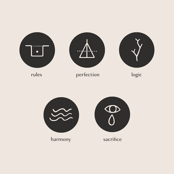
In today’s special, pre-season bonus episode on the podcast, I’m going to give you a behind the scenes to the design of the book cover and the special icons of the five Good Girl Myths. We’re going to hear from my editor at HarperCollins and a brand designer who consulted me on the project. For those of you ever thinking about writing your own book one day, this episode is a must.
Listen to the episode by going to ApplePodcasts, Spotify, or wherever you get your podcasts. And make sure to check out goodgirlmyth.com, to see the book cover design and the good girl myth icons to have more reference for this episode as you listen so that it will make way more sense.
Here’s what we talk about in this bonus episode:
My original vision for the book cover
How I navigated giving my publisher design feedback
How I overcame my own good girl mentality around changing my mind and expressing my vision
The design argument for putting pink on the cover (when I didn’t want pink in the beginning)
The unconventional choice we made for a women’s leadership book cover
How we resolved the tricky design challenge of the icons
Where we landed with all of it!
Episode excerpt:
Majo: Do you remember how in the beginning, I told my publisher I would never do pink? But when I saw that baby pink against the black, I knew it made sense. Friend and brand designer Vanessa Koch had my back on this one.
Vanessa: Here's what I would say with the shattered glass type concept. It felt like that was a main element to the design and we wanted to think about how color could serve to strengthen that concept. And when we thought about it, having a light-colored text on a dark-colored background felt like the best way. So our color questions went to, is that white? Is that a light purple? Is that a light pink? And so the baby pink felt like it was the color of the good girl. I know that my child had bedroom when I was seven years old, was basically this shade of pink and I think in a lot of ways for our generation it symbolizes a good girl and putting that into the type and then having that be broken apart felt like a really strong motif that we should lean into.
Also, just so you know, writing this book has been the hardest thing I've ever done in my life (I even cried about it on Instagram) and the support so far has been overwhelming. The book is rising in the charts, and it's so close to being #1 release in the Inspiration & Spirituality on Amazon (yay!)
Heroine, your little boost of support by pre-ordering here would really move the needle right now. And it means lots.
Lots of love,
Majo
P.S. You’ll be hearing from me again about the upcoming Spring season. I have the BEST season in the history of HEROINE planned, you will NOT believe the women I am going to interview. You can always follow along on Instagram too @majo.heroine for updates.